A_B_C
-
Posts
4,403 -
Joined
Recent Profile Visitors
6,310 profile views


-
 Find and Replace is your friend here. Make a Character Style with only the No-break Attribute set, and replace any sequence of three periods by a sequence of three periods formatted with this Character Style.
 -
 Terentyev Publisher reacted to a post in a topic:
Glyph substitutions must be highlighted
Terentyev Publisher reacted to a post in a topic:
Glyph substitutions must be highlighted
-
Oufti reacted to a post in a topic:
[Publisher 2.3 macOS] Problem with OT Features and Tracking
-
A_B_C reacted to a post in a topic:
Zebra Swallowtail Butterfly
-
[Publisher 2.3 macOS] Problem with OT Features and Tracking
A_B_C replied to A_B_C's topic in V2 Bugs found on macOS
Cool. Thanks for looking this up. 😀 -
A_B_C reacted to a post in a topic:
[Publisher 2.3 macOS] Problem with OT Features and Tracking
-
[Publisher 2.3 macOS] Problem with OT Features and Tracking
A_B_C replied to A_B_C's topic in V2 Bugs found on macOS
Many thanks! 😀 -
[Publisher 2.3 macOS] Problem with OT Features and Tracking
A_B_C replied to A_B_C's topic in V2 Bugs found on macOS
Of course, there is no issue in this case, because Publisher simply does not replace the uppercase glyphs by the small cap alternates when you enable Petites capitales (Small Caps). Both the uppercase glyphs and the small caps have the same metrics in my example font: The reported issue is specifically about tracking in the context of applied OpenType GSUB features. And this is where Publisher goes wrong. 🙂
-
[Publisher 2.3 macOS] Problem with OT Features and Tracking
A_B_C replied to A_B_C's topic in V2 Bugs found on macOS
Publisher 2.3.1, latest MAS version, macOS Sonoma 14.3.1 (23D60), MacBook Pro 16'', 2019, 2.6 GHz 6-Core Intel Core i7 -
Please take a look at the attached files. The .zip archive contains a Publisher file and a test font. The test font contains six glyphs /A/B/C/A.sc/B.sc/C.sc/, all of which are just rectangles of the same width (but different heights). There is something strange with the computation of tracking. In the screenshot below, there are two text frames, one containing the text string /ABC/ with the OpenType Feature c2sc applied to the text (blue text), the other one containing the string /A.sc/B.sc/C.sc/ where the small caps glyphs were entered through the Glyph Panel without using the OpenType Feature (red text). Additionally, a tracking value of -50 per mille is applied to both frames. Now, one would expect that the glyphs should perfectly line up. It shouldn’t matter whether the uppercase letters are replaced by the small caps letters through an OpenType feature or whether the small caps letters are directly inserted by the user through the Glyph Panel. The text should look identical. Yet, the two text frames look different. So there seems to be something wrong with your text shaper when tracking is applied. The glyph positions are not computed consistently. Please take a look. Thank you. 🙂 Test files: Tracking-Issue.zip
-
A_B_C reacted to a post in a topic:
how to disable export preview?
-
debraspicher reacted to a post in a topic:
how to disable export preview?
-
Aammppaa reacted to a post in a topic:
reflect along a line
-
debraspicher reacted to a post in a topic:
how to disable export preview?
-
— Miriam reacted to a post in a topic:
Metallic Effect For Logo
-
 — Miriam reacted to a post in a topic:
Metallic Effect For Logo
— Miriam reacted to a post in a topic:
Metallic Effect For Logo
-
A_B_C reacted to a post in a topic:
Some recent Designer work
-
2.3.0 to be released this morning!
A_B_C replied to Ash's topic in [ARCHIVE] 2.4, 2.3, 2.2 & 2.1 Features and Improvements
Thumbs up! Thank you for the great work. 😊 -
A_B_C reacted to a post in a topic:
2.3.0 to be released this morning!
-
A_B_C reacted to a post in a topic:
2.3.0 to be released this morning!
-
A_B_C reacted to a post in a topic:
2.3.0 to be released this morning!
-
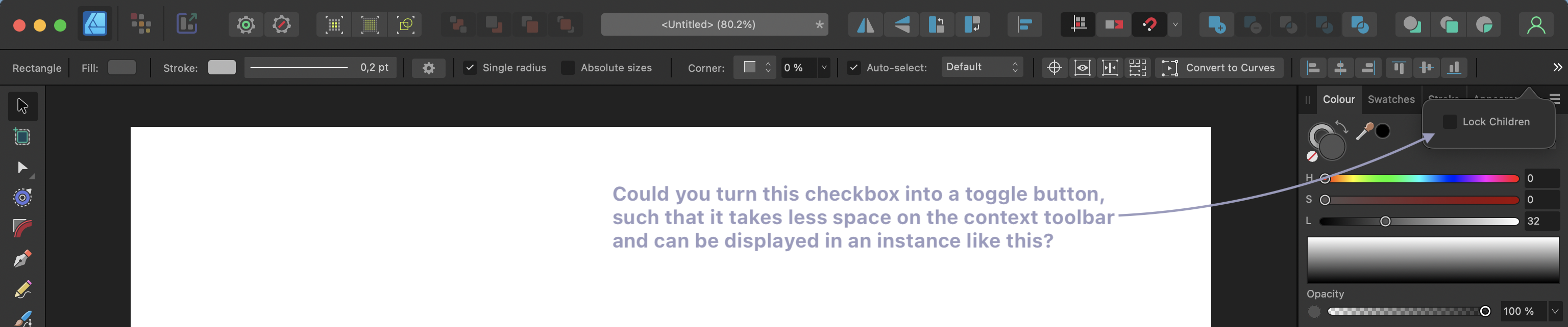
This is a super-tiny request, but it would help in recurring instances. Could you turn the Lock Children checkbox on the context toolbar into a toggle button with an icon, such that you can get rid of the label text? This way, the toggle would not require so much space on the context toolbar and could be shown in a situation like the one below. This is the full-width of a 16" MBP screen with these settings: It happens so often that I use a rectangle with child content, and Lock Children is always hidden in that instance. Please consider. 🙂
-
A_B_C reacted to a post in a topic:
2.3 New features and improvements list
-
vjmassny reacted to a post in a topic:
We are live, and thank you!!!
-
So it’s probably a slightly different problem than the one of the OP. Please split this thread if useful.
-
Ahh … I see what the problem is. Publisher 2.2 seems to open at the external screen’s resolution and does not understand that it plays now on a smaller field. When I grab the corner of the window frame and resize it, everything gets back to normal. Thank goodness there is a workaround, but the bug is still mildly annoying.
-
Similar problem here. Whenever I plug out my external 4k monitor (BenQ Design Vue PD Series, Thunderbolt to MacBook Pro 16'', 2019, macOS Ventura 13.6 build 22G120) and relaunch Publisher 2.2 on my internal MBP screen, my workspace looks like this. This is really a problem. Please fix.
-
We are live, and thank you!!!
A_B_C replied to Ash's topic in [ARCHIVE] 2.4, 2.3, 2.2 & 2.1 Features and Improvements
Congratulations to the new versions! The new features are awesome! It feels like everything is coming together. Keep up the great work, and grant yourself a little break now! You deserve it. 😀 -
Panel height not restored after double click on tab header
A_B_C replied to A_B_C's topic in V2 Bugs found on macOS
Thank you, Nathan. :) -
Hi there, please take a look at this. When I double click a panel to reduce it to the tab header, and double click it again to restore it, it always opens at minimal height: Panel-Height.mov This is very inconvenient, and I have the impression it hadn’t been that way in earlier versions. The panel should remember its previous height and be restored to this height when it is restored. Thanks for correcting.
-
Is there a point in my reply where I spoke about glyph widths? Or where I said that the glyph substitution would be responsible for the problem we see? Neither the first nor the second. 🙂 Rather, the only detail I meant to address was the following: Since you are aware of the distinction between characters (codepoints) and glyphs, you will understand that this way of speaking can be misleading. In OpenType Layout, we do not substitute characters for characters, but glyphs for glyphs. Hence, it does not make much sense to speak of “substituted characters” and properties such “characters” would “inherit.” This is likely to lead to a confusion between characters and glyphs and to paint a wrong picture of OpenType Layout processing. But as I said, the way of expression in the quote above does not invalidate your diagnosis (and there’s certainly no need to put every word under close scrutiny, if the underlying distinctions are clear – so no offense). As you noted, the application seems to lose track of which glyph corresponds to which character (with its particular line breaking property) when glyph substitution occurs. It does not retrace the text shaping process correctly before entering the stage where the output of the text shaper is distributed to paragraph lines.