smadell
-
Posts
1,151 -
Joined
-
Last visited


Recent Profile Visitors
9,696 profile views


-
 smadell reacted to a post in a topic:
Editing Skin Tones in Affinity Photo
smadell reacted to a post in a topic:
Editing Skin Tones in Affinity Photo
-
ronnyb reacted to a post in a topic:
Create & Edit Masks with Red Overlays
-
IthinkthereforeIam reacted to a post in a topic:
Reticulated Gradient Map - a FREE Macro Download
-
Best of luck with those windmills, Mr. Quixote.
-
henryanthony reacted to a post in a topic:
Canva
-
Patrick Connor reacted to a post in a topic:
Canva
-
I suppose so, @R C-R. May the Schwartz be with you.
-
I have always tried not to get sucked into these types of discussions, since they are usually about as fruitful as arguing politics or religion. But, I’m a little tired tonight and I thought I’d throw my 2 cents in. William, your notion that you should be paid for merely suggesting a software feature is beyond ludicrous. I apologize if I am being rude, but arguing the fine points of the difficulty in getting paid for making a suggestion is pedantry in the extreme. The whole nature of making a suggestion is being charitable (unless you are a paid consultant, and I’ll go out on a limb and guess that you are not). Now I have a suggestion. I think you should continue to make a series of long-winded and silly posts throughout the forum and follow up with post after post trying to decide how many angels can dance on the head of your particular pins. It would seem to me that you have two choices - you can (1) continue down the road you’ve been on for several years now (and, or course, pay me handsomely for making the suggestion), or (2) just stop (and save your money).
-
 The end is near. The sky is falling. What a swift kick in the cojones this was. I am looking at my options (as I’m sure we all are) and it would be foolish not to consider jumping over to Photoshop and Lightroom. Just in case that becomes the best option for me (and others), does anyone know if there is a way to batch convert .afphoto files to .psd files? I know I can export them one-by-one, but the Batch Processing panel will not allow saving as PSD and macros cannot record a save or export. Anyone know if this is possible?
 -
affinity photo Greyscale and colour profiles
smadell replied to itsRachel's topic in Share your work
Hi, @itsRachel. I doubt that a change in color profile will solve anything for you. Your scanner has produced a “flat” result - one with very little contrast. This can be addressed easily in Affinity Photo. I downloaded your attached JPG (in the first post) and it only took a few minutes to get a result that looks more like the original photo. (And this is on my iPad, using my sausage fingers, only!) I applied 4 layers - 2 adjustments and 2 live filters (and only to the scanned photo portion, hence the masks that you can see in the Layers panel). A screenshot is attached. No change in color profile at any point.
-
With photos like this, I’ve found (usually)that getting rid of a color cast using the “Divide Fill” method works best. Sometimes, a simple White Balance adjustment just doesn’t seem to cooperate. I downloaded your image (in the first post) and put a white Fill layer above it, setting the Blend mode to Divide. I clicked on an area that should be white (you’ll see I placed a small red circle on an area of snow in the mountains). I’ve posted the result below - the change is subtle, but definitely a bit less blue. Also, here’s a link to a good YouTube video by Robin Whalley that goes over the technique.
-
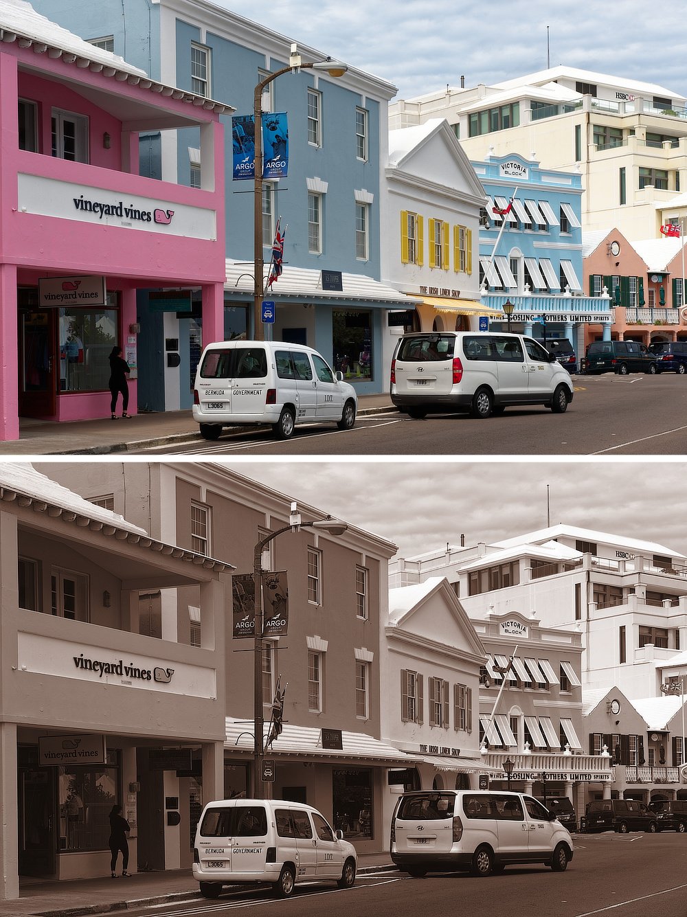
At one point, I had created my own version of a sepia effect as a macro. But, I later found a website by James Ritson (one of the staff at Serif, and the creator of most of the official Affinity Photo tutorials): https://jamesritson.co.uk/ If you visit the web page, and click in the "Resources Page" link at the top, James has a large number of downloadable files. Among these is a free collection of macros called "JR Filter Gallery Macros v4". This group of macros contains one called "Sepia Effect" and it is a great implementation of sepia coloration. It was much better than what I had created on my own, and it now serves as my go-to if I ever need a sepia color grade. Adding a vignette and/or a paper texture is still an easy addition. But, the coloration provided by James' macro is superb. (Plus, you can play with all the other macros in the set, and some of them are also quite remarkable.) Here's a before and after, using a photo from Front Street in Bermuda:
-
 smadell reacted to a post in a topic:
Day to Dusk photo
smadell reacted to a post in a topic:
Day to Dusk photo
-
Day to Dusk photo
smadell replied to Andrew Leiataua's topic in Affinity on Desktop Questions (macOS and Windows)
Hi, @Andrew Leiataua - I'm not about to create a video tutorial (just not comfortable with that) but I had a go at twilight-ing your sample photo. I've attached the Affinity Photo file along with this post. 1) I made selections of the sky and of the windows, and saved them as Separate Channels. If you open the Channels panel, you'll see them there. 2) I selected the sky, inverted the selection, and masked the Original House photo. Then, I put a substitute sky layer underneath the Original House. 3) I added 2 additional child layers to the Original House layer, in order to adjust the lighting. First, I added a Fill Layer to darken the house and to give it a more orange color (so as to pick up some of the color of the substituted sky. I set the Blend Mode of the Fill layer to Soft Light. Then, I added a Curves adjustment to further darken and add contrast to the foreground. 4) I added a Pixel layer above the Original House layer and cloned out the shadows, since those harsh shadows wouldn't exist at that time of day. 5) I added another pixel layer and selected the Windows (using the saved Spare Channel). I created a Mask using that active selection. Before anything else, I selected the mask and applied a Gaussian Blur (from the Filter menu, so destructive) to soften the edges. Back to the pixel layer, I used the paint brush to fill the layer (i.e., only the masked areas will show up) with a yellowish color. I set the blend mode to Add. Instead of modifying the Opacity, I opened the Blend Options panel and lowered the Fill Opacity to 60%. This gave a better overall effect. I didn't have to add a separate "glow" since I was happy with the effect as it stood. 6) Another pixel layer was used to paint in the light coming from the lamps above the garage door. This had a diminished opacity, and a blend mode of Add. 7) Last, I added a Curves adjustment at the very top of the layer stack to selectively lighten, darken, and add a bit more contrast to the overall image. With more time and effort, it could be better. I'm not really happy with the pots in front of the front door (they're still too dark) and some other details. But, I think this is a good start. A lot of what I did was lifted (and adapted) from the YouTube Photoshop video you included, but I didn't like some of the stuff he did and added some of my own interpretation. Twilight House.afphoto
-
LUMINOSITY MASK VS NORMAL MASK
smadell replied to Ghomul's topic in Affinity on Desktop Questions (macOS and Windows)
Glad to help you out, @Ghomul. I find Compound masks a pain sometimes, but they make things so much more powerful - a double-edged sword, of a sort. -
 smadell reacted to a post in a topic:
LUMINOSITY MASK VS NORMAL MASK
smadell reacted to a post in a topic:
LUMINOSITY MASK VS NORMAL MASK
-
LUMINOSITY MASK VS NORMAL MASK
smadell replied to Ghomul's topic in Affinity on Desktop Questions (macOS and Windows)
(8Hi, @Ghomul. If I understand what you’re trying to do, you need to use a Compound Mask. The compound mask should probably contain (i) the Luminosity Range mask; and (ii) a “regular” mask. On the regular mask, make sure to paint white on the areas on which the luminosity mask should apply, and black on the other parts. Then (and this is the important part) set the “operator” to Intersect. That will make sure the compound mask applies only to areas that are white on both masks. By the way, Easter is spelled with only 1 “s”. -
smadell reacted to a post in a topic:
Reticulated Gradient Map - a FREE Macro Download
-
smadell reacted to a post in a topic:
Reticulated Gradient Map - a FREE Macro Download
-
Hi again, @jmwellborn. I assumed you were talking about the "10,000 Feet" pdf only because we had talked about it so much at the time. Also, it didn't occur to me that I had included a pdf with the Reticulated Gradient Map macro. Anyway, you're right – the fonts are different. The pdf that I included with the Reticulated Gradient Map macro uses Goudy Old Style, boldface for the headers and regular for the body text. I think that the attractive thing about the font is the "old style" variation; it gives it a different look that I like quite a bit. Also, the Ten Thousand Feet book can be located at: Good to hear from you again.
-
Good afternoon, Jen! I assume you mean the "Ten Thousand Feet" pdf. In that document, the "headlines" were various sizes and weights of Avenir, and the body text was 12-point Palatino. Also, the font used on the cover and title pages was ITC Benguiat Std.
-
smadell reacted to a post in a topic:
Document Has Disappeared
-
Document Has Disappeared
smadell replied to lynda Stevens's topic in Affinity on Desktop Questions (macOS and Windows)
Maybe this is just another benefit of using a Mac…
-
Document Has Disappeared
smadell replied to lynda Stevens's topic in Affinity on Desktop Questions (macOS and Windows)
Well, @lynda Stevens, that hard drive cleanup is your most likely culprit. In the absence of a local or remote backup, I'm afraid you're out of luck. (Not like any of us have ever been there ourselves…) At the very least, you could use the saved PDF version as a reference. You might be able to extract text from it, and you'll have a reference for the layout of text frames, images, and so forth. That should help. -
Document Has Disappeared
smadell replied to lynda Stevens's topic in Affinity on Desktop Questions (macOS and Windows)
Good morning, @lynda Stevens. Has the file simply disappeared from the “Open Recent…” choices? Or, is it really gone from your hard drives? When you did the initial “Save As…” you saved the file, with the name of your choosing, to a specific location. Do you remember where that is? If so, simply use Open… from the File menu and open the file directly from wherever it resides. If you don’t remember where you saved it, you can search for it by name using Windows (I am a Mac user, so someone with Windows know-how will have to tell you how to do that.) More than likely, the actual file is probably right where it has always been, but has “fallen off” the Open Recent list because that list will only contain the last x number of files you worked on, and you have worked on at least x+1.