biscuit
-
Posts
84 -
Joined
-
Last visited
Recent Profile Visitors
1,099 profile views


-
 biscuit reacted to a post in a topic:
Sneak peeks for 1.7
biscuit reacted to a post in a topic:
Sneak peeks for 1.7
-
 The Help manual doesn't seem to work in the beta.
 -
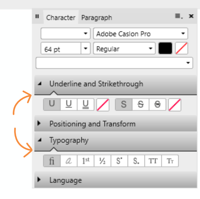
Hi there, A few remarks about the light UI: 1) Point size in toolbar is not properly aligned: 2) Line around fill less crisp than around stroke: 3) Contrast and hierarchy seems to be off in this example: Lack of contrast in panel header between selected Character and Paragraph. Subheading seem darker and more defined than panel header Point of high contrast and clearest division is the line when de-collapsing the subheading (orange arrows). There's a stark division within the subbox and barely any contrast between the light of the gradient (top of subpanel) and the rest of the panel. At first glance the marked lines seem to divide the entire panel in three blocks.

-
Hi, The program doesn't notify me of having sent a crash report, so I assume it didn't. Here is one 245e575c-edd3-4ec3-890a-31f584d5e815.dmp, I've got two more. When scrolling down the font list in the Glyphs browser AD crashes. It's at the end of the list. It doesn't crash when scrolling down the character panel. The last fonts are Webdings, Wingdings and Yu Gothic. When filtering "Missing" in the character panel it lists Webdings, so that might be the cause.
-
Wow, that stabilizer works like a charm! Smooth, completely responsive en very intuitive. The first time I opened the glyph browser the glyphs were white and contrast and legibility were very poor (light UI). Maybe because I started in dark UI and switched to light UI before opening panel? Maybe because I had a light foreground colour selected? Can't reproduce.
-
Hi a3k4, This hasn't changed. The only vector brushes you can expand are the basic ones with a pressure profile applied. And these generate an insane amount of vector points so only use when really necessary.
-
biscuit reacted to a post in a topic:
Global Text Styles
-
drawroht reacted to a post in a topic:
Additional object alignment options?
-
Additional object alignment options?
biscuit replied to drawroht's topic in [ARCHIVE] Designer beta on Windows threads
Another option would be to space horizontally with 0mm. (Uncheck auto-distribute first.) -
Hi, The beta version just suddenly crashed while scrolling through the font list. Didn't create a crash report.
-
Hi there, While trying out the font Cabrito Didone in AD I noticed it has true Small Caps, but no true All Small Caps. Checking All Small Caps doesn't turn caps into small caps. Probably the opentype-coding of the font is lacking, but it would be nice if AD was smart enough to produce All Small Caps from true small caps. (Turn caps into lowercase and then into small caps?). Now you have a font with true small caps and a button All Small Caps but it's no use. I would really like an all lowercase setting in the typography options as well. When trying out concepts it's much quicker to be able to toggle lowercase/caps/sentence. I use this feature in InDesign a lot.
-
On their site they also have AD-templates for app-icon designs. https://bjango.com/designresources/
-
Hi & happy 2017! -When opening a new document the font family of "body" text style is set to Arial while its based on "base". Shouldn't this be set to "no change"? -How can you set the "Body" paragraph spacing to "no change"? Basing its spacing on the "Base" style.
-
Hi Chris, I've had the same problem before but can't reproduce it now (problem occurred in earlier beta). What seemed to be the problem was that Photo also registered the mouse input while using my Bamboo tablet. There was some screen glitching and when releasing sometimes it picked the colour from the pen input and sometimes from the mouse (which I wasn't using). I used the color picker with Alt in the brush tool.
-
shortcuts that do not work
biscuit replied to Michail's topic in [ARCHIVE] Photo beta on Windows threads
Hi, Crtl+D is to deselect. Ctrl+H in PS hides the selection while keeping it active. Very handy, but I don't think Affinity has this functionality yet. -
Dadoscope reacted to a post in a topic:
Biscuit's adventures in Affinity Designer
-
Seanh reacted to a post in a topic:
Biscuit's adventures in Affinity Designer
-
Aammppaa reacted to a post in a topic:
Biscuit's adventures in Affinity Designer
-
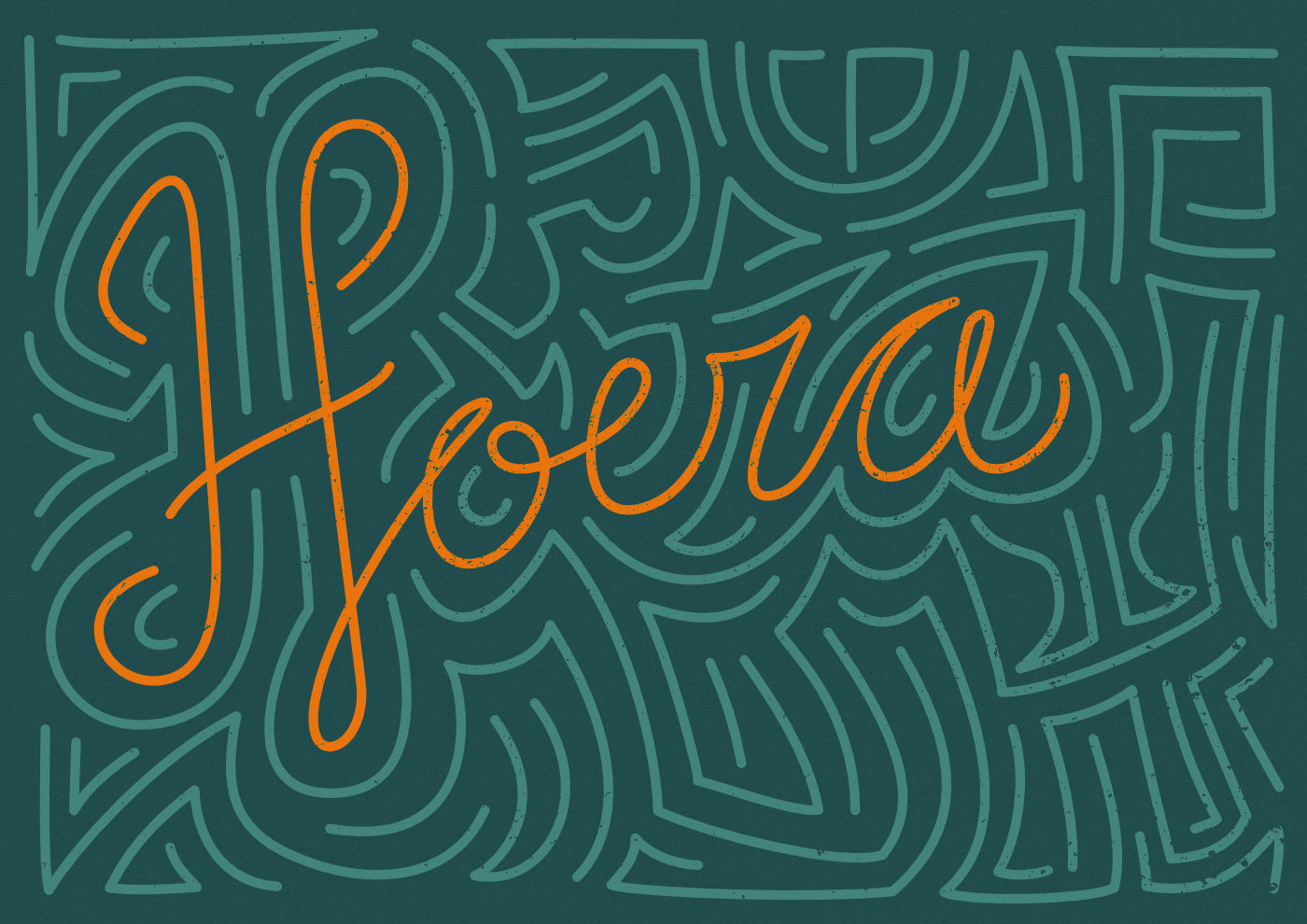
affinity designer Biscuit's adventures in Affinity Designer
biscuit replied to biscuit's topic in Share your work
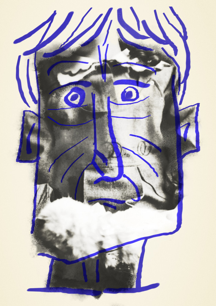
This last one was actually finished with the official release of AD. Printed it as a poster as a present for my younger brother. I'm not an illustrator so getting human poses right or working with perspective are not my forte. With just two shades of each colour it was quite tricky to keep al the objects distinct. And I had difficulty keeping the amount of detail consistent. Especially the face and the hair seem a bit off to me.
-
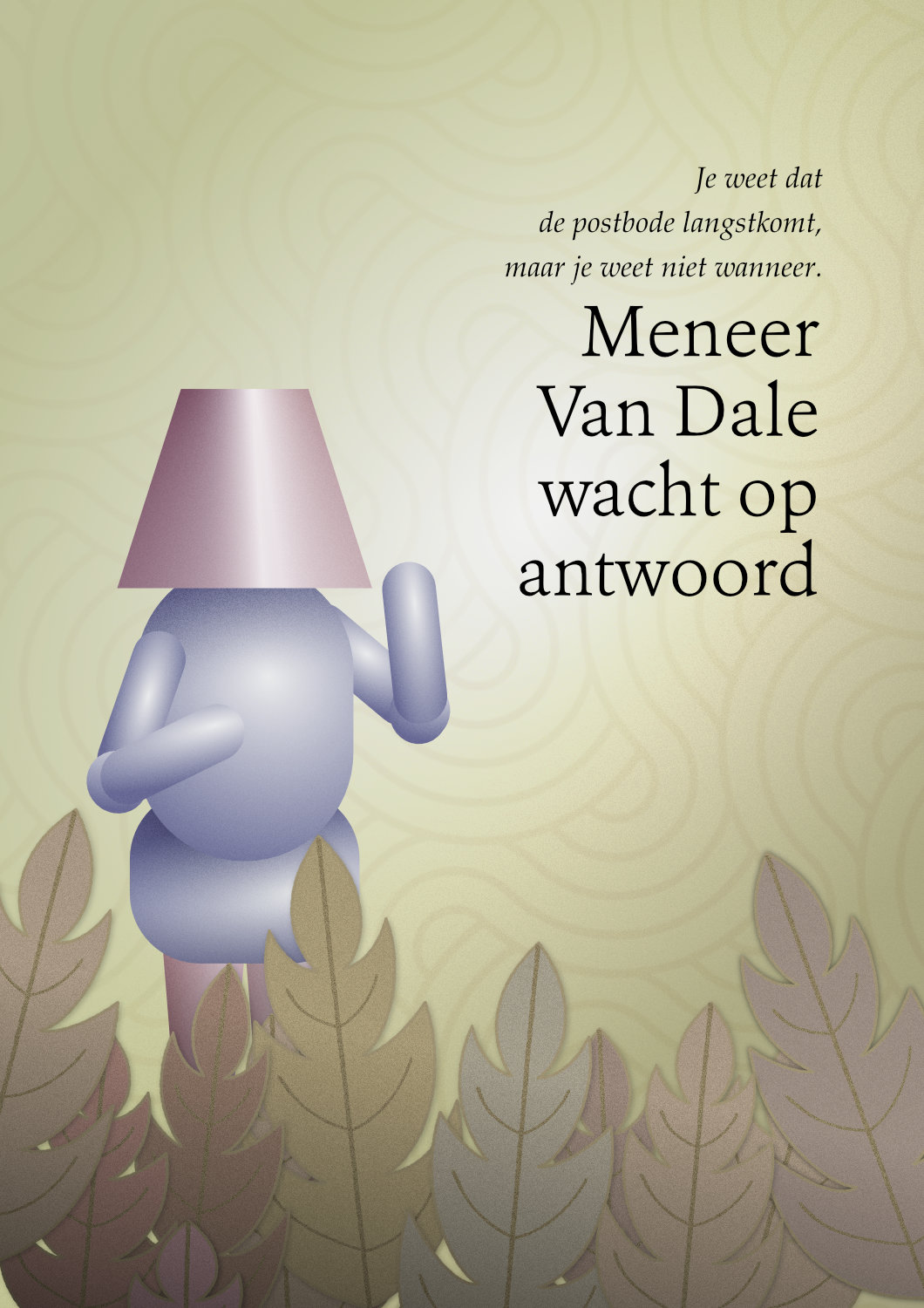
affinity designer Biscuit's adventures in Affinity Designer
biscuit posted a topic in Share your work
Hi there, I'm a graphic designer mostly working in InDesign and have been playing with AD since it started in beta. Following some presentable experiments along the way. I'm quite typography-oriented so tried out typesetting and opentype options first. Here I was trying the pencil tool and path handling. The texturing is done with a grunge texture with layer blend ranges applied, set to erase blend mode. Continuing with power duplicate and layer masking in the pixel persona. 'Refine selection' should be useful here but couldn't get any helpful results. Here I was getting the hang of gradients and symbols with the leaves at the bottom. The geometric background pattern wasn't created by me. This capital R started out as a comparison between node types: manual brezier curves vs auto smooth nodes. Combining brushes with a photo. I don't draw well and haven't found my smooth AD inking groove yet. Next full vector illustration. I already appreciated the technical abilities of AD. But when doing illustration I noticed the ease of use compared to Illustrator. Just drag to clip, everything clearly laid out in the layers panel and not getting stuck in the transparency panel. Playing around with gradients and blend modes. Could be an abstract book cover.
-
wordsberry reacted to a post in a topic:
Man in space
-
Nice abstract gradient in the space ship flame! How did you achieve that effect? Drawing to a grid and then rounding of with the corner tool? The ship itself looks a bit light and flat imo. Regarding the astronaut: the purple helmet looks a bit void, A darker base with highlight or planet reflection might give it a bit more depth. The composition could do with a bit more hierarchy, I think. As it is the planet and the astronaut are about the same size and sit next to each other in the middle.